Tabs. Slideshows. Featured content sliders. Isn't it all the same thing? SliderTabs is a customizable jQuery plugin that allows you to create a content slider that can turn into a tabs plugin or a custom slider by changing a few options. Let SliderTabs the scaffolding for your next custom slider or set of tabs.
This is still a relatively new project so if you discover a bug, please let me know on this project's Github page!
|
|
How I Met Your Mother is an American sitcom that premiered on CBS on September 19, 2005, created by Craig Thomas and Carter Bays, and directed by Pamela Fryman.

Parks and Recreation is an American comedy television series on NBC led by Amy Poehler who stars as Leslie Knope.
Although it began as a spin-off to The Office, Daniels and Schur have since created a stand-alone series that shares that show's single-camera, mockumentary filming style, but differs in its optimistic tone.
The Office is a popular mockumentary/sitcom that was first made in the United Kingdom and has now been remade in many other countries, with overall viewership in the hundreds of millions worldwide. The most popular and lengthy version has proven to be the U.S. version, which has lasted for eight seasons and 164 episodes as of January 2012. The German version is also still in production and has seen 46 episodes over five seasons.
South Park is an American animated sitcom created by Trey Parker and Matt Stone for the Comedy Central television network. Intended for mature audiences, the show has become famous for its crude language and dark, surreal humor that lampoons a wide range of topics. The ongoing narrative revolves around four boys—Stan Marsh, Kyle Broflovski, Eric Cartman and Kenny McCormick—and their bizarre adventures in and around the titular Colorado town.
House (also known as House, M.D.) is an American television medical drama that debuted on the Fox network on November 16, 2004. The show's central character is Dr. Gregory House (Hugh Laurie), an unconventional and misanthropic medical genius who heads a team of diagnosticians at the fictional Princeton-Plainsboro Teaching Hospital (PPTH) in New Jersey.
Terra Nova is an American science fiction drama television series. It premiered on September 26, 2011 with a two-hour premiere, and the first season concluded on December 19, 2011 with a two-hour finale. The series follows the Shannon family as they travel 85 million years into the past. The series is based on an idea by British writer Kelly Marcel.
30 Rock is an American television comedy series created by Tina Fey that airs on NBC. The series, which is loosely based on Fey's experiences as head writer for Saturday Night Live, takes place behind the scenes of a fictional live sketch comedy series depicted as airing on NBC. The series' name refers to 30 Rockefeller Plaza in New York City, the address of the GE Building, in which the NBC Studios are located. This series is produced by Broadway Video and Little Stranger, Inc., in association with NBCUniversal.
Unzip the package into your working directory and include them in your head section like this. Make sure you include jQuery before the plugin.
<head>
<link rel="stylesheet" href="styles/jquery.sliderTabs.min.css">
<script src="http://ajax.googleapis.com/ajax/libs/jquery/1.7.1/jquery.min.js"></script>
<script src="js/jquery.sliderTabs.min.js"></script>
</head>
First make a div element including first a list of links for tabs and the same number of div elements afterwards for panels. To link the div panels to the tabs, make sure that the href attribute of the tab links is '#IdOfPanel'. Note that list of tabs is required markup even if you plan on disabling tabs as other parts of the plugin like indicators depend on these declarations. Here's a basic example.
<div id="mySliderTabs">
  <!-- Unordered list representing the tabs -->
  <ul>
    <li><a href="#canyon">The Grand Canyon</a></li>
    <li><a href="#taj">The Taj Mahal</a></li>
    <li><a href="#bigben">Big Ben</a></li>
  </ul>

  <!-- Afterwards, include the div panels representing the panels of our slider -->
  <div id="canyon">
    <h3>The Grand Canyon</h3>
    <!-- rest of the panel content -->
  </div>
  <div id="taj">
    <h3>The Taj Mahal</h3>
    <!-- rest of the panel content -->
  </div>
  <div id="bigben">
    <h3>Big Ben</h3>
    <!-- rest of the panel content -->
  </div>
</div>
Then select the container div with jQuery and call sliderTabs() on it.
var slider = $("div#mySliderTabs").sliderTabs();
... or specify some options. View a full list of available options in the next section.
var slider = $("div#mySliderTabs").sliderTabs({
  autoplay: true,
  mousewheel: false,
  position: "bottom"
});
| Key | Default | Description |
|---|---|---|
| autoplay | false | false or integer - Number of milliseconds betweeen transitions to the next tab. |
| tabArrowWidth | 35 | integer - Width in pixels of the tab arrows. |
| classes | {
leftTabArrow: '',
panel: '',
panelActive: '',
panelsContainer: '',
rightTabArrow: '',
tab: '',
tabActive: '',
tabsList: ''
}
|
Additional classes to add to important elements. Useful for custom styling. |
| defaultTab | 1 | integer - Index of the tab selected by default. (1-indexed) |
| height | null | integer - Set a static value for the height of the whole widget in pixels. |
| indicators | false | boolean - Show panel indicators. |
| mousewheel | true | boolean - Allow scrolling to the next and previous panel using the mousewheel. |
| position | 'top' | 'top' or 'bottom' - Position of the tabs relative to the panel container |
| panelArrows | false | boolean - Show the next and previous panel arrows. |
| panelArrowsShowOnHover | false | boolean - Hide the panel arrows unless the panel container is being hovered over. |
| tabs | true | boolean - Use tabs |
| tabHeight | 30 | integer - Height in pixels of the tabs container |
| tabArrows | true | boolean - Use tab arrows when tabs overflow out of their container. |
| tabSlideLength | 100 | integer - Number of pixels to slide the tabs when using the tab arrows. |
| tabSlideSpeed | 200 | integer - Number of milliseconds of the tab sliding transition. |
| transition | 'slide' | 'slide' or 'fade' - Transition to use for panel transitions. |
| transitionEasing | 'easeOutCubic' | string - Name of the easing function to use for panel transitions. Use any easing functions included with jQuery UI. Note that there is no need to actually include jQuery UI. |
| transitionSpeed | 500 | integer - Number of milliseconds of the panel transition. |
| width | null | integer - Set a static width in pixels for the widget. |
<div id="demoSlider">
<ul>
<li><a href="#pyramid"></a></li>
<li><a href="#gardens"></a></li>
<li><a href="#zeus"></a></li>
<li><a href="#temple"></a></li>
<li><a href="#mausoleum"></a></li>
<li><a href="#colossus"></a></li>
<li><a href="#lighthouse"></a></li>
</ul>
<div id="pyramid"><img src="images/pyramid.jpg" /></div>
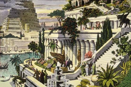
<div id="gardens"><img src="images/gardens.jpg" /></div>
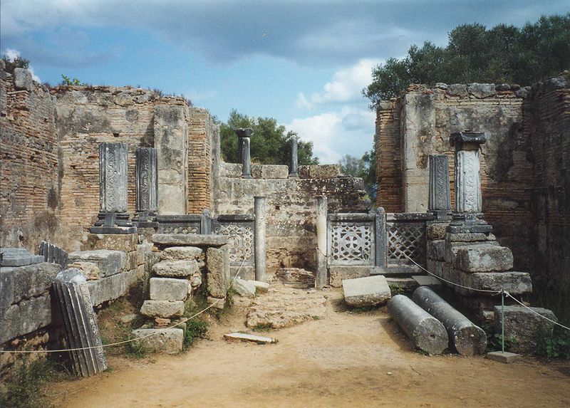
<div id="zeus"><img src="images/zeus.jpg" /></div>
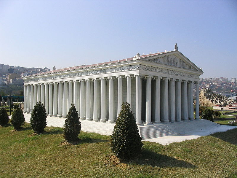
<div id="temple"><img src="images/miniaturk.jpg" /></div>
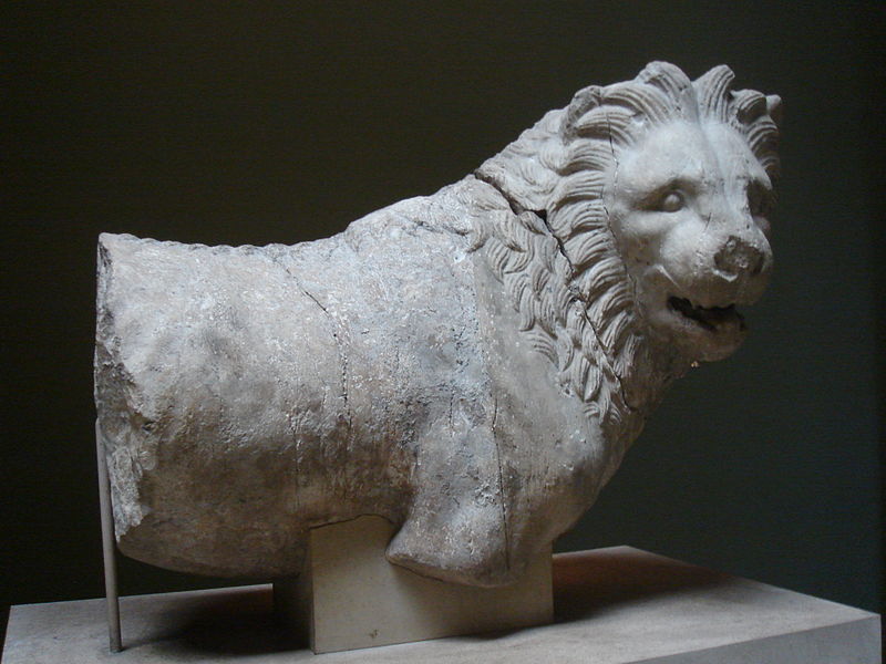
<div id="mausoleum"><img src="images/mausoleum.jpg" /></div>
<div id="colossus"><img src="images/colossus.jpg" /></div>
<div id="lighthouse"><img src="images/lighthouse.jpg" /></div>
</div>
var demo = $("div#demoSlider").sliderTabs({
  indicators: true,
  panelArrows: true,
  panelArrowsShowOnHover: true,
  tabs: false,
  classes: {
    panel: 'demoPanel'
  }
});
.demoPanel{
  padding: 0;
  background-color: #222;
  text-align: center;
}
.demoPanel img{
  width: 100%;
}
SliderTabs powers the landing page for my startup StudyCloud. It's used for both the main slider and the embedded sliders in the first two sections.